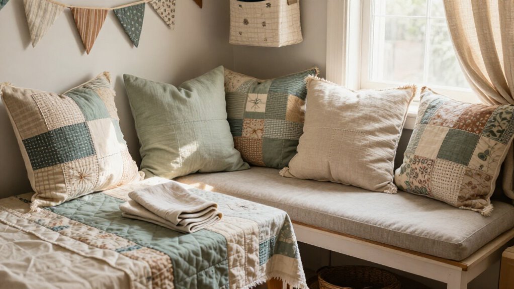


I’ve picked 21 calming, stylish bedroom paints you’ll actually want to live with, from soft neutrals like pale oak and greige to light gray, muted sage, dusty blue, and warm clay. I’ll show which suit small rooms, which pair best with wood or brass, and when to use matte versus satin. I’ll also warn about overly bright reds and the importance of testing samples in different light, and I’ll offer simple headboard and accent-wall ideas if you keep going.
Key Takeaways
- Choose soft neutrals (pale beige, greige) to create a timeless, calming backdrop that reflects light and feels cozy.
- Use muted blues and dusty teals for restful, restorative bedrooms that pair well with warm neutrals and natural wood.
- Incorporate earthy tones like muted sage, warm clay, or terracotta as single accent walls for grounded warmth and texture.
- Prefer matte or low-sheen finishes for large areas, and satin where extra durability and subtle sheen are needed.
- Test large painted samples on different walls at various times of day to ensure color harmony with lighting and textiles.
Soft Neutral Shades
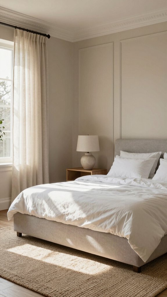
Soft neutrals are my go-to when I want a bedroom that feels calm, cozy, and easy to live with. I pick soft neutral palettes—warm whites, muted taupes, and soft grays—to build a timeless backdrop that invites rest and belonging. I recommend shades like Pale Oak (OC-20) or Calm (OC-22); they mute visual noise and make the room feel gently held. For depth, I layer a lighter wall tone with slightly darker trim or an accent wall, then add calming textures—linen curtains, wool throws, textured pillows—to keep the space tactile and warm. These tones work with many decor styles, so you can change accessories without repainting. Start simple, test samples in different light, and trust how the room makes you feel.
Warm Beige and Greige Options
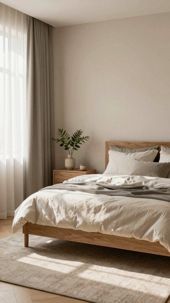
If you like the calm, lived-in feel of muted palettes, warm beiges and greiges are the next natural step because they add more depth without stealing the room’s peaceful vibe. I love how beige undertones and greige variations give a bedroom that cozy, lived-in feeling while still feeling fresh. They reflect light softly, so small rooms feel airier, and they pair easily with wood, soft linens, or bold accents. Try layering textures—wool, linen, woven baskets—to deepen the look. Here are feelings I aim for when I choose these tones:
- Warmth: a gentle hug after a long day.
- Belonging: a space that welcomes everyone.
- Calm: colors that hush the mind.
- Timelessness: looks that won’t date quickly.
Choose shades nearby on the swatch and test at different times of day.
Light Gray for Modern Bedrooms
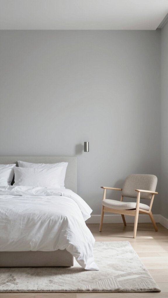
One of my favorite go-to choices for a modern bedroom is light gray, because it gives you a calm, sophisticated backdrop without feeling cold or fussy. I often recommend light gray when someone wants a space that feels open and welcoming; it plays well with soft blues, muted pastels, or subtle earthy accents. Use light gray textures—like woven throws or linen curtains—to add warmth, and bring in light gray accents such as pillows or a rug to tie the room together. Light gray also visually expands small rooms, making them feel airy and cozy. Try pairing it with natural wood furniture and simple metallics for contrast; you’ll get a peaceful, modern look that’s easy to personalize.
| Benefit | Pairing | Tip |
|---|---|---|
| Calming | Soft blues | Add linens |
| Airy | Muted pastels | Use wood |
| Versatile | Metallics | Layer textures |
Earthy Tones for Relaxation
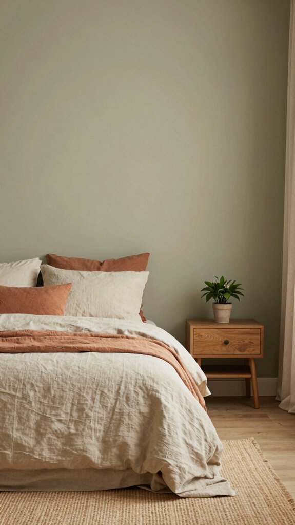
Because I love bringing the outdoors in, I often reach for earthy tones like warm clay, muted sage, and soft terracotta when I want a bedroom that feels calm and grounded. I choose these hues because they echo nature, reduce visual noise, and make a cozy, safe space where you belong. For practical calm, paint one wall an earthy accent and balance it with soft browns or linen neutrals. I layer textures—wood furniture, linen curtains, woven rugs—to deepen comfort through texture layering, and I compare a smooth wall to a tactile throw to show contrast. Try muted sage for peace or terracotta for warmth, then add gentle lighting to complete the nurturing sanctuary.
- Embrace warmth to feel safe
- Invite calm with natural tones
- Connect through shared comfort
- Build belonging with soft textures
Muted Blue Color Palettes
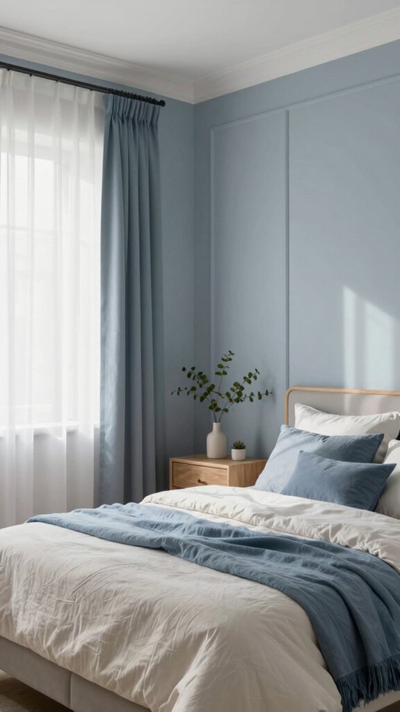
After falling for earthy clay and sage, I also reach for muted blues like dusty blue and smoky steel when I want a bedroom that feels quietly fresh and calm. I choose muted blue aesthetics because these soft blues lower heart rate and blood pressure, helping me and my guests relax and sleep better. With natural light, the room feels more spacious emotionally, so I place lighter blues on walls and keep trim slightly warmer. For a tranquil bedroom design, I pair blues with warm neutrals, textured linens, and wooden accents to make the space inviting and grounded. Tip: use a lighter blue backdrop for flexibility, then add deeper smoky hues in textiles to create depth without overwhelming the calm.
Soft Green Paint Choices
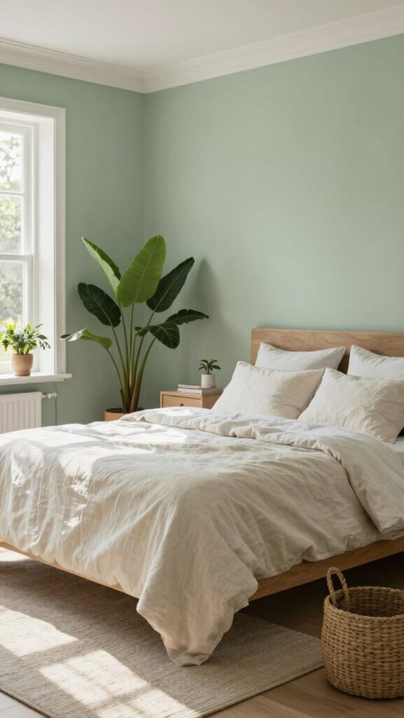
Want a bedroom that feels like a quiet garden retreat? I love soft green paint choices because they bring nature indoors and help me unwind. Sage green feels gentle and familiar, while muted olive adds earthy depth without overwhelming the room. Think about light: north-facing spaces stay cozy with warmer greens, and sunlit rooms let softer tones breathe.
- A sage green wall invites calm, like a warm hug from nature.
- Muted olive anchors a room, pairing beautifully with wood and linen.
- Soft greens reduce stress, so you’ll sleep and wake more refreshed.
- Use varying textures—wool, rattan, cotton—to make the color feel like home.
I’ll help you pick the right shade for your light and style.
Warm White Variations
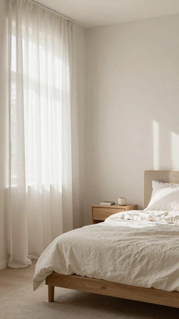
If you’re aiming for a bedroom that feels open, cozy, and easy to style, warm white variations like Neutral Ground are a perfect starting point. I often choose these shades because they reflect light gently, making a small room feel spacious while keeping things intimate. Warm white textures, from eggshell walls to matte ceilings, add subtle depth without stealing attention, and warm white finishes help you coordinate furniture and bedding easily. Consider how morning sun and bedside lamps change the tone, and test samples at different times. I recommend pairing warm whites with natural wood and soft textiles to deepen comfort. This approach creates a calm, welcoming space where you and guests can relax and feel truly at home.
Blush and Dusty Pink Hues
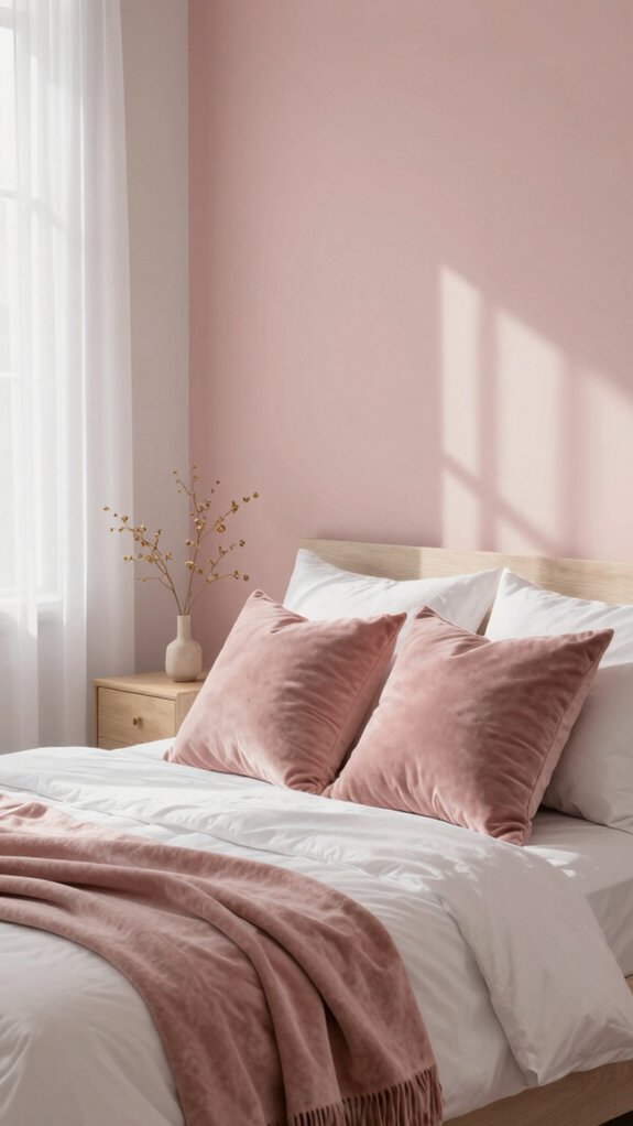
Softness is the word I reach for when I talk about blush and dusty pink hues, because they instantly make a bedroom feel warm, calm, and just a little bit elegant. I love how blush benefits show up in reduced stress and a cozier mood; these tones invite rest and connection. Dusty pink elegance comes through when you pair muted pink walls with natural wood, brass accents, or soft gray linens. Try blush in textiles—bedding, curtains, throw pillows—to tie the room together without overwhelming it. If you want contrast, add deep neutrals or white trim for balance. Use these tips to create a welcoming space where you and loved ones can relax and feel truly at home.
- Gentle warmth that invites closeness
- Subtle sophistication for any decor
- Stress-reducing, sleep-friendly tones
- Easy to mix with neutrals and textures
Moody Dark Colors for Accent Walls
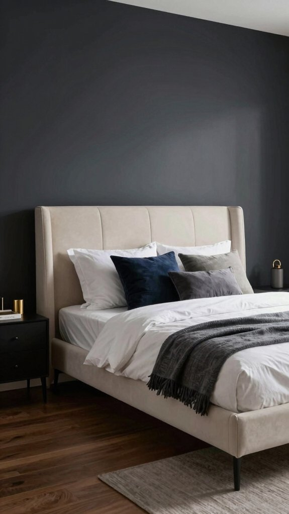
Blush and dusty pinks welcome you with gentle warmth, but sometimes you want a different kind of hush—one that’s deeper and a little more dramatic—so I like to reach for moody dark colors for an accent wall. I use deep blues, charcoals, and rich greens to create an enveloping comfort that still feels stylish. Understanding dark color psychology helps me choose shades that reduce visual stimulation and promote rest. Pairing a dark accent wall with lighter furniture balances the room, and I always test colors in different light. Here’s a quick guide to take into account:
| Mood | Tip |
|---|---|
| Deep blue | Calming, pairs with soft linens |
| Charcoal | Sophisticated, needs warm lighting |
| Rich green | Grounding, complements wood tones |
| Lighting | Test at day and night |
| Balance | Use light furnishings and textiles |
Two-Tone Wall Color Ideas
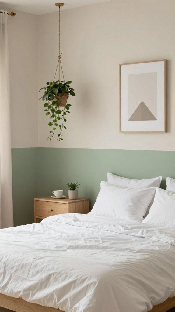
Want to make your bedroom feel layered and intentional without going overboard? I love two-tone wall color ideas because they add depth and calm without clutter. I use two tone techniques like a lighter upper wall and a deeper lower wall to make a space feel cozy yet open. Color combinations such as dusty blue with warm off-white or muted teal paired with creamy beige give a balanced, soothing focal point. Two-tone designs also let you show personality while keeping the room peaceful.
- A soft blue top with a warm neutral bottom that hugs you in the evening.
- Dusty blue and off-white for restful, shared moments.
- Muted teal accent wall with creamy beige for gentle drama.
- Pale green and sandy taupe to feel grounded together.
Paint Finishes That Matter
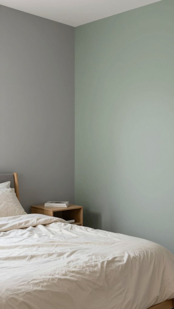
I want to talk about matte versus satin finishes and how that choice changes the feel of a bedroom. Matte keeps walls soft and hides bumps, so it’s great for a calm, cozy look, while satin has a gentle sheen that bounces light and makes colors pop without being too shiny. I usually recommend matte for large wall areas and satin for trim or places that need occasional wiping, so you get both a forgiving surface and a bit of lively depth.
Matte vs satin
Because the finish you pick changes how a room feels and behaves, I like to start by comparing matte and satin side by side so you can choose what matters most for your bedroom. I’ll be honest: I love matte advantages for a cozy, intimate vibe — it hides wall flaws, absorbs light, and feels modern and soothing. Satin benefits show up when you need durability and a soft sheen; it brightens a room, cleans up spills, and adds gentle warmth. Think about traffic, moisture, and touch-ups: choose matte for calm, easy-to-blend walls, or satin for practical elegance that stands up to life. I want you to feel at home with whichever option fits your daily rhythm.
- Embrace comfort
- Choose durability
- Value warmth
- Share your space
Color Psychology for Sleep
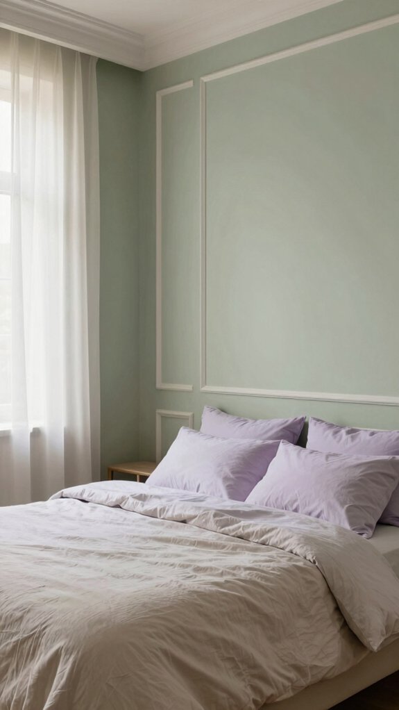
Color can quietly shape how you feel the moment you walk into your bedroom, and I’ll show you which tones help you unwind and why. I pay attention to color temperature because cool tones like soft blues and greens lower heart rate and calm the mind, while warm neutrals such as beige and taupe wrap you in cozy comfort. For a natural, minimalist feel, try earthy sage green—it connects you to nature without overstimulating. If you want a sleep-promoting cocoon, a soft charcoal on one wall reduces visual noise and signals nighttime. Each choice has clear emotional impact, so pick a palette that supports your routine: cool for serenity, warm neutrals for comfort, and dark accents for restful enclosure.
Matching Paint with Lighting
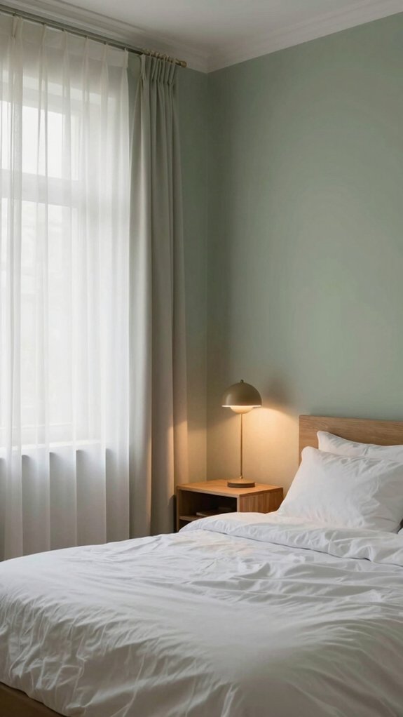
Ever wondered why a wall that looked lovely in the paint store seems different at home? I’ll walk you through matching paint with lighting so your bedroom feels like it belongs to you. Natural light boosts soft blues and pale greens by day and lets darker hues feel cozy at night. Artificial light changes things too: warm incandescent bulbs make cool tones feel inviting, while cool LED lights highlight fresh, soft hues. Test samples in morning sun and evening lamps, and note the room’s direction—east-facing rooms suit cooler tones, south-facing ones love warm, sunny shades. Include ceiling and trim choices for cohesion.
- Try samples at different times to feel the shift
- Pair lighting types with gentle color combinations
- Embrace cozy evenings and airy mornings
- Choose trims that tie everything together
Small Bedroom Color Strategies
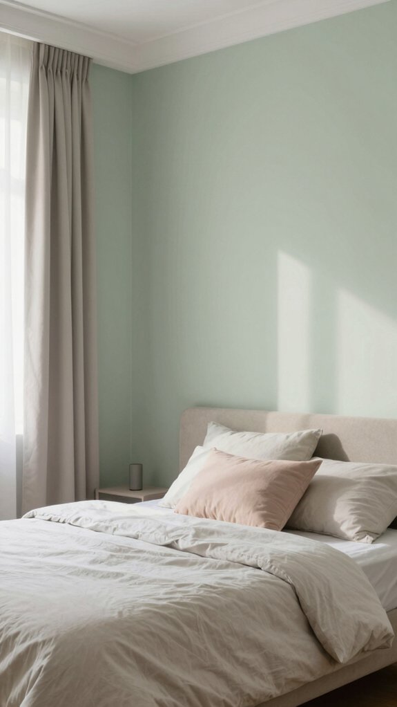
When a room is small, the paint you choose can either open it up or make it feel cramped, so I like to start with a clear plan: pick light, airy base colors—soft off-whites, pale pastels, or gentle greys—that reflect more light and create a sense of space, then layer in soothing muted blues or greens to keep things calm. I suggest building a cohesive palette with soft neutrals and one or two calming hues so your color combinations feel intentional and comforting. Try an accent wall in a deeper shade to add depth without crowding the room. Always test samples in morning and evening light to see how they shift. Trust your personal preferences, and tweak tones until the space truly feels like yours.
Paint Colors for Cozy Bedrooms
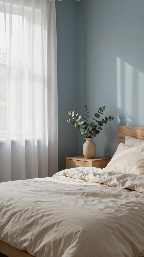
If you want your bedroom to feel like a warm, restful hug, start with soft off-whites or warm neutrals as your foundation—I like Neutral Ground or a gentle taupe because they reflect light without feeling cold and they set a calm tone for the whole room. I pair those bases with cozy color combinations: dusty blue for lowered stress, sage green to bring nature in, or warm clay for tactile warmth. Layer textures—linen curtains, muslin throws—to deepen comfort. For balance, add soothing accent hues in pillows or a single wall.
- Embrace a neutral base to invite everyone in and create belonging.
- Add muted blue accents to calm the heart.
- Use sage or clay for earthy warmth.
- Layer textiles for tactile coziness.
Paint Choices for Minimalist Style
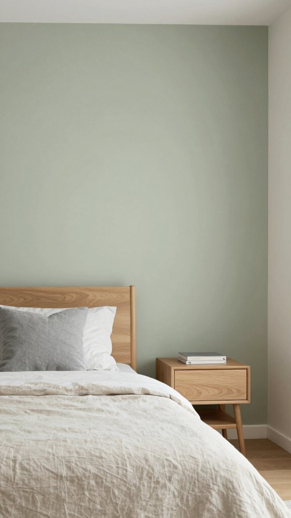
You’ve warmed up a cozy bedroom with soft neutrals and layered textiles; now I’ll show you how to pare that feeling back into a minimalist sanctuary without making the room feel cold. I’d choose warm whites or pale grays as a base, then add Soft Charcoal or Pale Oak on an accent wall to introduce depth without clutter. For a natural note, try Sage Green or muted taupe; they pair with minimalist decor and create subtle contrast. Keep one cohesive palette with slight variations so calming textures—linen, matte paint, wood—become the stars. Test swatches in morning and evening light to verify colors stay soothing. With these steps, you’ll make a simple, welcoming room that feels both peaceful and lived-in.
Paint Colors That Age Well
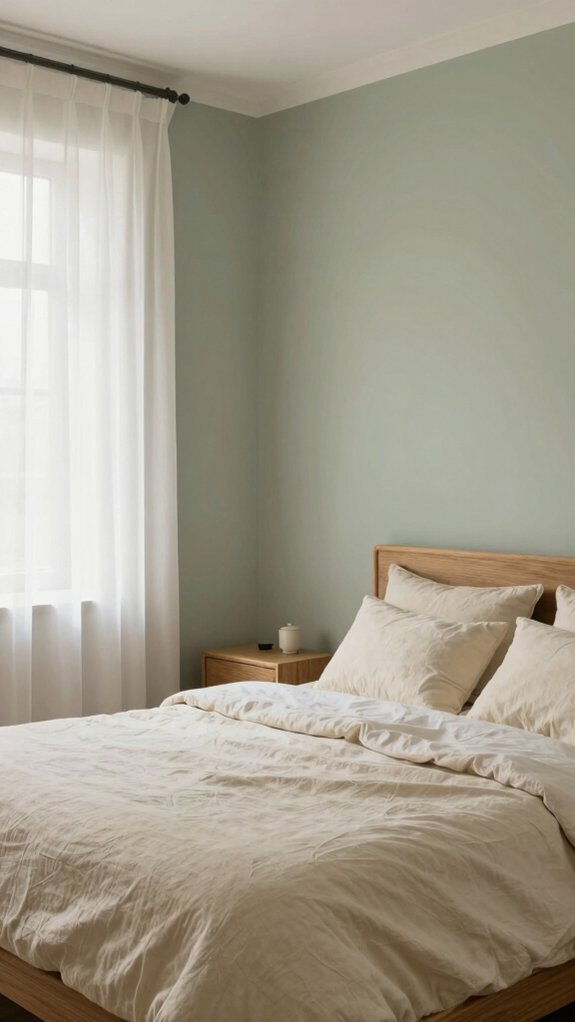
Because a bedroom should feel reassuring for years, I lean toward colors that quietly hold up to changing trends—soft neutrals, muted earth tones, and gentle pastels—and I’ll show you how to pick them so the room keeps looking fresh. I choose shades that create timeless palettes and make lasting impressions without shouting for attention. Coventry Gray or Pale Oak work as sophisticated backdrops; warm whites like Neutral Ground keep things classic; sage and soft blues bring calm and a connection to nature. Start with a main wall color, add a slightly darker trim, and introduce textiles in complementary muted tones to update the look without repainting.
- Feel welcomed by steady, comforting hues.
- Trust colors that grow with your style.
- Choose subtle contrasts for depth.
- Let softness invite rest and belonging.
Season-Neutral Paint Options
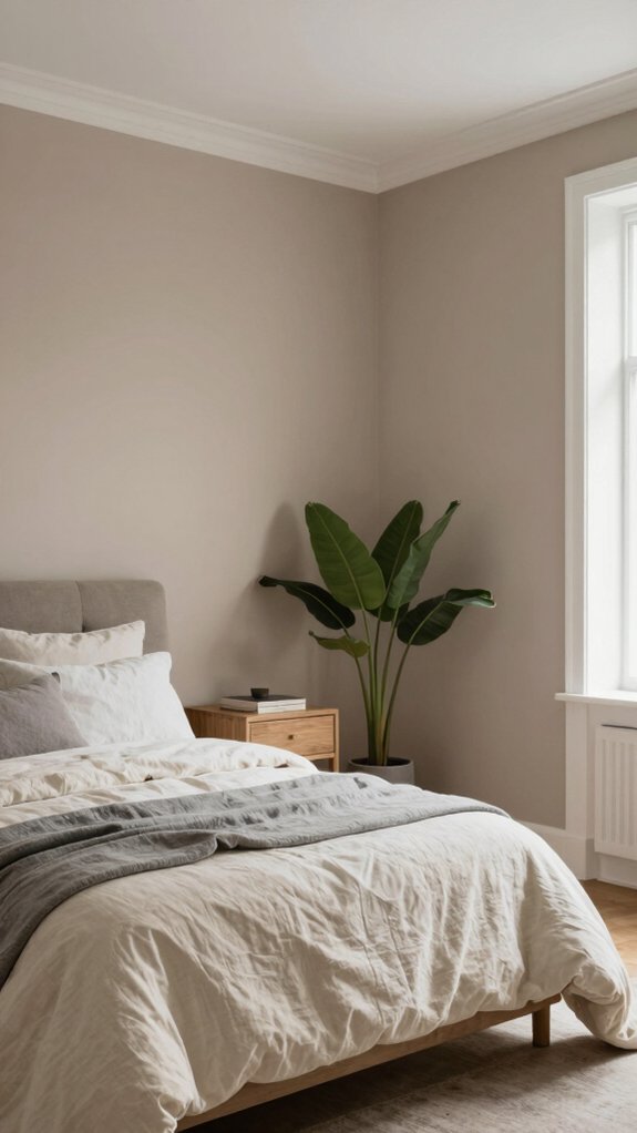
A season-neutral paint palette gives your bedroom a steady, welcoming base that can shift easily with decor and weather, and I’ll walk you through the best options and how to use them. I like to begin with timeless palettes: soft off-whites, warm beige, and muted taupe create a backdrop that never feels dated, so you can change accents each season without repainting. For color without fuss, choose versatile hues like sage green or dusty blue to bring calm and a nod to nature. Warm clays and earthy tones add cozy depth in cooler months, while light grays read modern and pair with both warm and cool accents year-round. Tip: test swatches on different walls and live with them for a week.
Headboard Wall Color Ideas
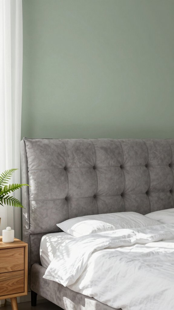
If you’ve already picked a season-neutral base for the whole room, focus the eye by painting the headboard wall a contrasting but complementary shade — I like to treat that wall as the room’s focal point and a cozy backdrop for sleep. I choose soft blues like dusty blue or light gray when I want calm; muted sage brings nature indoors, while creamy off-white or beige keeps things timeless. For evenings when I want a cocoon, soft charcoal or deep teal adds depth. Think about headboard texture and how paint plays with it — smooth paint with a textured headboard feels layered, while matte with a tufted headboard reads luxe. Add a subtle accent wall color for warmth, like blush or muted terracotta.
- You’ll feel soothed and held.
- It invites quiet conversation.
- It welcomes rest nightly.
- It connects the room to you.
Common Paint Color Mistakes
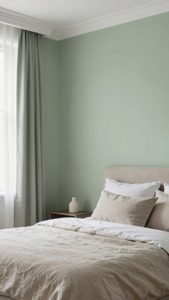
When you’re choosing paint, I’ve seen people get tripped up by a few predictable missteps, and I want to help you avoid them so your room actually feels like the calm retreat you’re aiming for. First, don’t pick overly bold reds or oranges thinking they’ll feel cozy; they energize and can disturb sleep. Consider room orientation: cooler shades suit sunlit south-facing rooms, while warmer tones work in north-facing spaces. Mind surrounding elements—furniture, textiles, and finishes will change how a color reads, so test swatches nearby. Beware color mixing and heavy paint layering without checking the final result; subtle shifts accumulate and create an unexpectedly intense mood. Finally, think about psychology: soft blues and greens encourage calm, while too-dark hues can feel oppressive.
Test Before You Commit
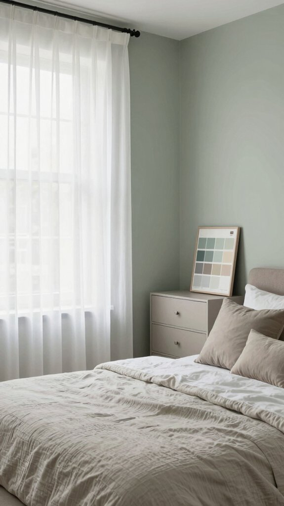
You’ve read about common pitfalls, so now let’s make certain a color you love on a paint chip actually looks that way on your walls. I always do color testing in the room itself, because lighting effects — natural and artificial — can change a hue from soothing to sharp. I paint large samples on different walls, then live with them for a few days.
- Morning sun warms cool blues, making them feel welcoming.
- Evening lamps bring out gray undertones, so watch mood shifts.
- Test samples near furniture to guarantee harmony with textiles.
- Stand in different spots to feel how the color makes the whole room belong to you.
This step helps you choose a calm, stylish color that truly fits your space.