

I’ve pulled 15 practical tips for using Pantone’s 2026 Color of the Year, Cloud Dancer: treat it as a warm white backdrop for walls, layer textures like linen and wood for cozy depth, use matte lighting to avoid glare, pair with muted beiges or soft grays, add bold art or plants for contrast, test contrast for legibility in branding, and use it as a capsule wardrobe anchor; follow these steps and you’ll see how easily it brings calm, warmth, and versatility to any project if you keep exploring.
Key Takeaways
- Use the Color of the Year as a neutral anchor to create cohesive palettes across interiors, fashion, and branding.
- Layer textures and finishes (linen, wood, matte paint) to add depth without relying on strong hue contrasts.
- Test contrast and legibility before applying the color in UI, packaging, or signage to ensure accessibility.
- Pair the Color of the Year with seasonal accents—pastels for spring, earthy tones for autumn—to keep designs timely.
- Apply the color selectively as backdrop, focal accent, or packaging highlight to signal quiet luxury and emotional resonance.
What “Color of the Year” Means
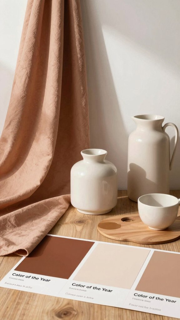
Think of the “Color of the Year” as a cultural compass that designers and brands use to steer their choices for the next 12–18 months, and I’ll walk you through what it really means.
I see it as a signal of cultural significance and an invitation to belong — a color chosen after a year-long committee review that blends psychology, sociology, and current events. Its emotional impact guides fashion, home decor, and branding, so you can match mood to message.
Practically, use it as a palette anchor: pair it with warm neutrals for comfort, or contrast with bold hues for energy.
Think of trends it started since 2000; they’re roadmaps, not rules, and you’re free to modify them.
Pantone’s 2026 Pick: Cloud Dancer
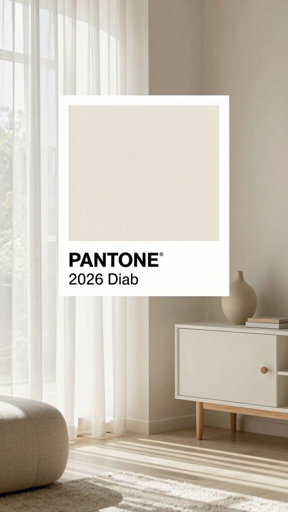
I’m excited to talk about Pantone’s 2026 pick, Cloud Dancer, because its balanced white neutral can calm a room without feeling cold.
I’d suggest using it as a backdrop for warm wood, soft textiles, or muted accent colors to keep spaces spa-like and inviting, and you can compare it to pure white—less stark, more soothing.
Let’s look at practical ways to layer this tone so it reads as quiet luxury instead of plain or sterile.
Balanced white neutral for calm spaces
Because a clean slate can feel like a small, quiet celebration, I’m excited to investigate how Pantone’s Cloud Dancer—a balanced white neutral—can reshape calm spaces.
I’m drawn to its white emotionality, the way it invites belonging and soothes without erasing personality. Start with walls in Cloud Dancer to create a spa-like backdrop, then layer warm woods and soft textiles so the room feels lived-in, not sterile.
For contrast, pick one muted accent—sage, warm gray, or deep navy—to anchor the eye. In branding or product design, use infinite shades of white around Cloud Dancer to add depth and tactile cues.
Test finishes: matte for softness, satin for gentle reflection. These steps help build serene environments that welcome and comfort.
How Cloud Dancer Reflects Today’s Mood

When I look at Cloud Dancer, I see more than a soft white — I see a deliberate pause in a loud world, a color that invites quiet and clarity. I feel its psychological impact immediately; it calms and centers us, encouraging reflection and connection. Its cultural significance is clear: choosing white as Color of the Year says we’re seeking simplicity and shared authenticity. I’ll guide you through what that means and how brands can use it to belong, not vanish, offering honest, spa-like restraint with room for personality.
| Emotion | Message | Invitation |
|---|---|---|
| Calm | Clean slate | Join in rest |
| Trust | Quiet luxury | Be authentic |
| Possibility | Minimalism | investigate together |
Using Cloud Dancer in Interiors
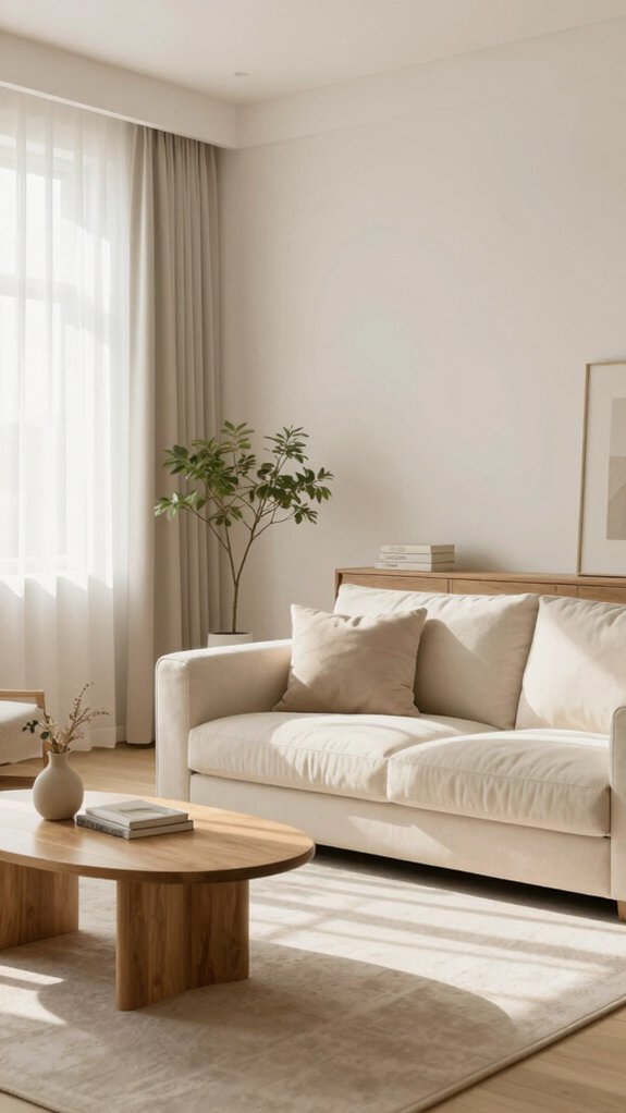
If you want a room that feels like a deep exhale, I’ll show you how Cloud Dancer can do that without making the space feel cold or boring.
I use Cloud Dancer (PANTONE 11-4201) to create minimalist aesthetics that still welcome people in, and it’s perfect for tranquil environments like bathrooms and living rooms.
Here are practical ways I apply it:
- Paint walls Cloud Dancer to open a room, then layer tactile textiles for warmth.
- Use it as a backdrop for bolder accents—art, plants, or wood—so each piece pops.
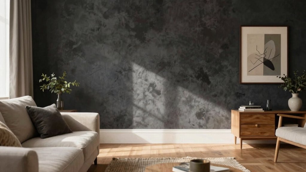
- Pair with soft lighting and matte finishes to keep a spa-like, cozy mood.
- Mix textures—linen, stone, metal—to maintain quiet luxury without sterility.
You’ll feel included and calm in spaces I design this way.
Cloud Dancer with Neutral Palettes
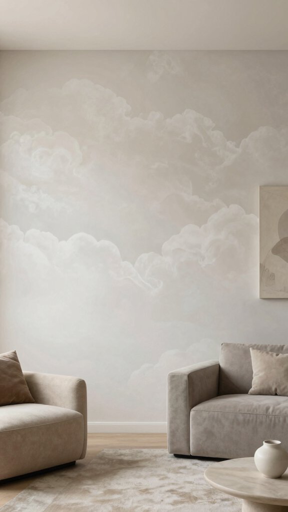
Cloud Dancer blends beautifully into neutral palettes, and I’ll show you how it lifts a room without stealing the show: think of it as a soft canvas that lets creamy whites, warm beiges, and gentle grays play together while keeping the mood calm and cohesive.
I use Cloud Dancer to create serene spaces that welcome people in and help them feel they belong. Start by painting walls in Cloud Dancer, then layer textures—linen curtains, wool throws, matte ceramics—to add depth without clutter.
For minimalist designs, keep furniture lines simple and let light highlight subtle variations in the white. In branding or decor, this shade signals quiet luxury and a cultural shift toward simplicity, so pair it with tactile materials and thoughtful negative space.
Accent Colors That Pair Well
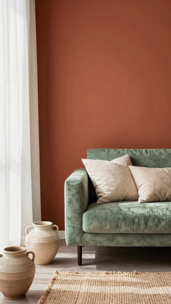
I like pairing pastels and muted tones with the Color of the Year because they soften bold hues and create calm, layered looks that feel intentional.
Try blush pinks, powder blues, or sage greens alongside Cloud Dancer or a deep burgundy to see how gentle tints highlight the main color without stealing focus, and use one slightly stronger pastel as an accent to guide the eye.
For a practical setup, stick to two pastel neutrals plus one muted contrast—arrange them in textiles, small decor, or trim so the room reads cohesive and balanced.
Pastels and muted tones
Think of pastels and muted tones as the soft-spoken teammates in a design lineup—I often reach for pale pink, soft lavender, or mint green when I want to temper a bold shade like Mocha Mousse without losing visual interest.
I use pastel psychology to bring calm and inclusivity into a space, and muted elegance helps balance warmth with modernity. Here are practical ways I pair them:
- Use a pale pink accent wall to soften Mocha Mousse furniture and invite cozy conversation.
- Add soft lavender textiles for contrast that feels gentle, not fussy.
- Introduce mint green accessories to lift a palette while keeping serenity.
- Combine muted tones with rich hues in small doses to create balance and belonging.
These tips work for interiors, fashion, and branding.
Cloud Dancer in Fashion Trends
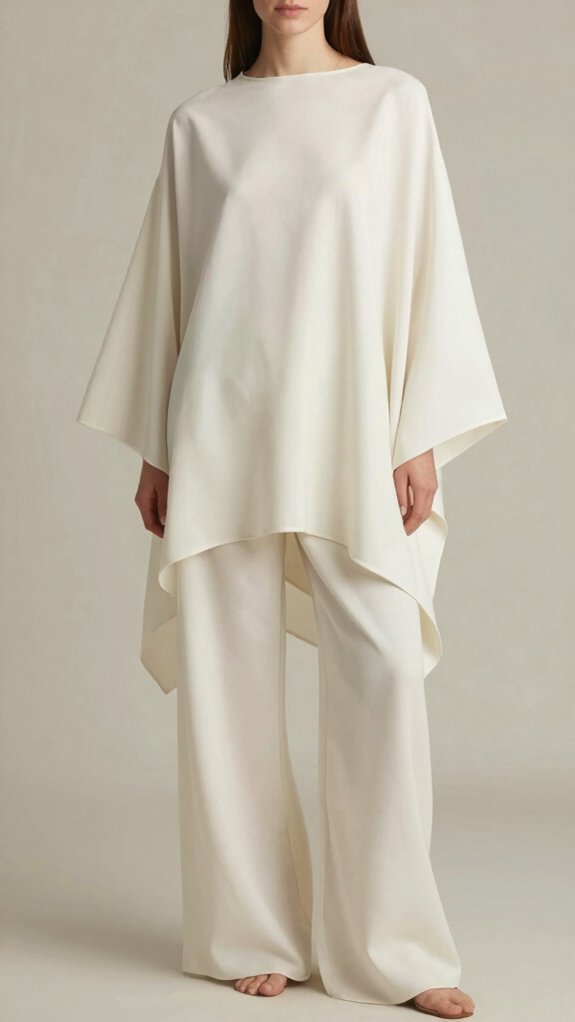
Because a fresh, muted white can feel like a reset, I’m excited to show how Cloud Dancer (PANTONE 11-4201) will shape upcoming fashion collections; it’s the kind of neutral that reads as quiet luxury and invites designers to play with texture and silhouette.
I see Cloud Dancer anchoring minimalist fashion and wellness aesthetics, offering a spa-like calm that helps people feel seen and comfortable.
Try mixing textured knits, silk blouses, and structured tailoring to create depth without color noise. Pair it with earthy browns or soft pastels for warmth and subtle contrast, or choose tonal layering for an elegant, communal vibe.
From casual wear to evening pieces, Cloud Dancer adjusts easily—focus on fabric choice, proportions, and gentle detailing to make every look feel intentional and inclusive.
Incorporating Cloud Dancer in Decor
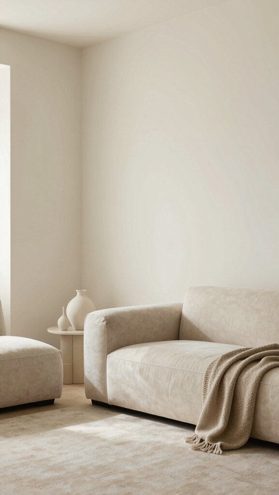
When I walk into a room painted Cloud Dancer, I immediately feel the space breathe a little easier, and that quiet, spa-like calm makes it simple to build a layered, welcoming interior.
I like using Cloud Dancer as a clean slate, so larger furniture pieces or a feature wall set a serene tone while letting personal touches shine.
Think about furniture arrangements that encourage conversation and ease, and mix texture combinations—linen, wood, and soft wool—to keep warmth without clutter.
Try these steps:
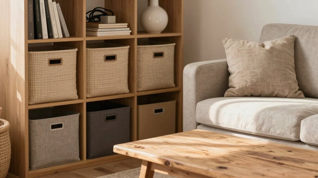
- Anchor the room with a light sofa and natural wood coffee table.
- Add tactile rugs and throws for cozy depth.
- Use earthy accent colors in pillows and plants.
- Keep lighting soft to preserve that tranquil, inclusive feel.
Color of the Year in Graphic Design

As a designer, I love how Pantone’s Color of the Year—like Cloud Dancer—gives us a ready-made mood to build on, and I’ll show you practical ways to use it so your work feels fresh and relevant.
I tap into color psychology to guide palette choices, pairing Cloud Dancer with grounding neutrals or vibrant accents like Transformative Teal to signal sustainability and innovation.
Start by testing contrast for legibility, then apply design techniques such as grid systems, hierarchy, and focal points to direct attention.
Use it in campaign visuals, social posts, and UI mockups so your pieces feel current and cohesive.
Because choices reflect culture, integrating the Color of the Year helps us connect and belong with our audience.
Branding and Packaging Use
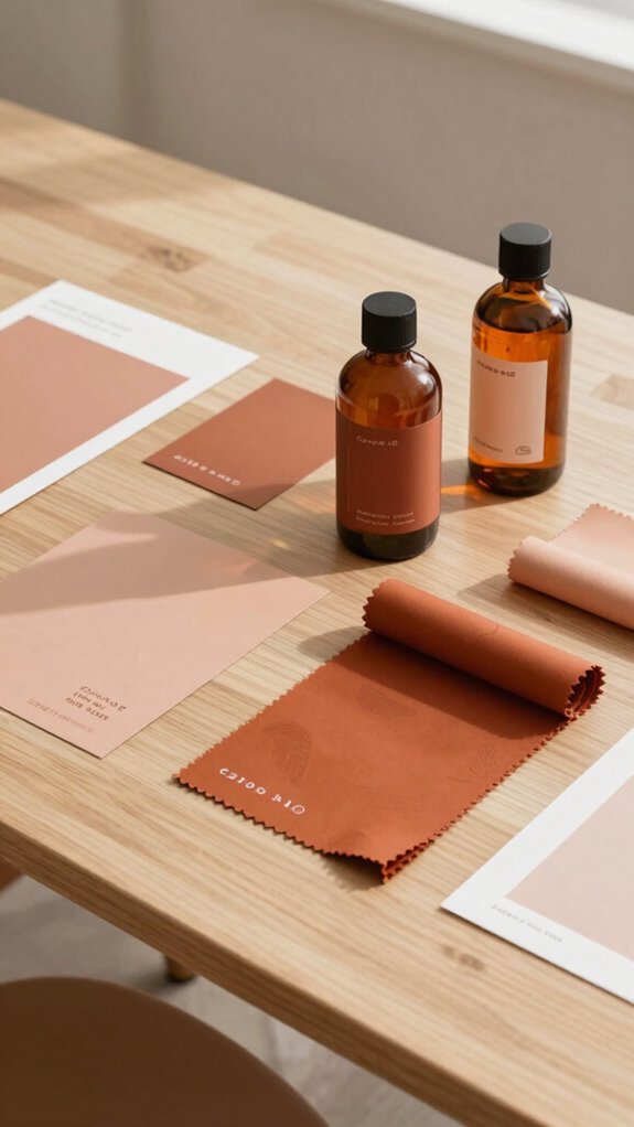
If you want your product to stand out on the shelf and in shoppers’ minds, I’d start by weaving the Pantone Color of the Year—Cloud Dancer—into both brand signals and packaging structure so the color feels purposeful, not tacked-on.
I’ve seen how Cloud Dancer brings calm and a touch of luxury, and you can use that to create belonging for your customers through cohesive branding strategies and thoughtful packaging design.
- Use Cloud Dancer as a primary accent to unify logo, labels, and online visuals.
- Pair it with neutral textures for a simple, serene shelf presence.
- Apply it selectively to callouts and seals to signal quality and sustainability.
- Test variations for contrast, readability, and emotional resonance before rollout.
Cloud Dancer in Seasonal Styling
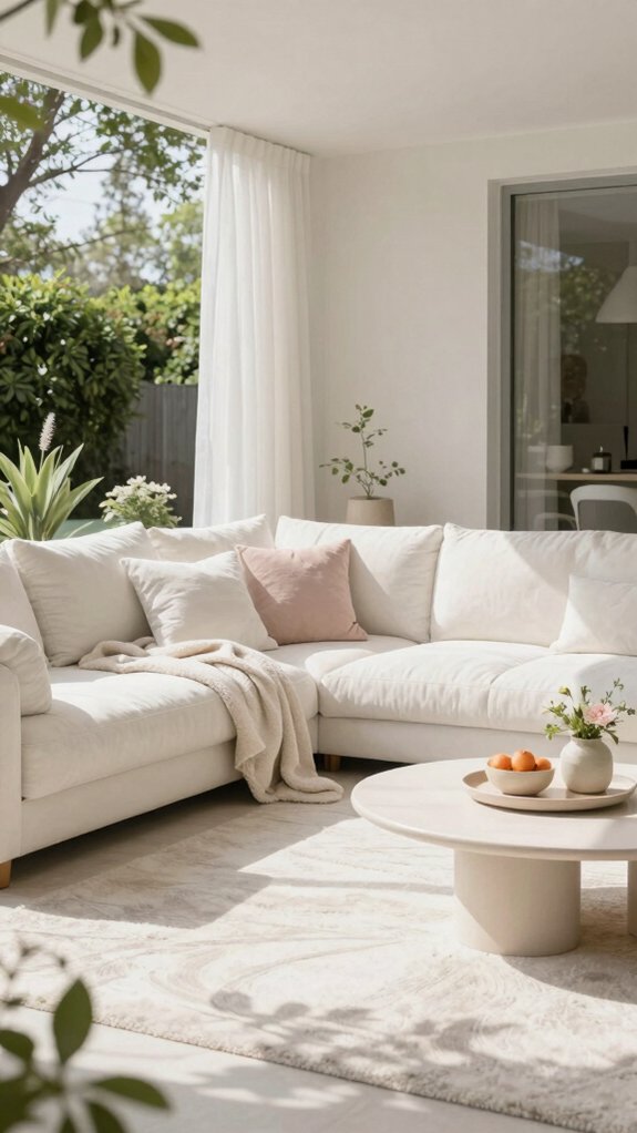
Because Cloud Dancer feels like a clean slate with a hint of quiet luxury, I love using it as the backbone for seasonal styling—it’s calming enough for winter gatherings, fresh enough for spring refreshes, and light enough to balance richer fall and summer accents.
I start by layering seasonal textures—wool throws and velvet in winter, linen and cotton in summer—so the white feels lived-in, not cold. For a minimalist aesthetics approach, I pair Cloud Dancer with soft pastels in spring and earthy tones in autumn, which keeps looks cohesive and modern.
In fashion, it anchors capsule pieces; in homes, it creates spa-like rooms. Try one focal Cloud Dancer item per space, then add two supportive colors to build warmth and belonging.
Historical Comparison to Past Picks
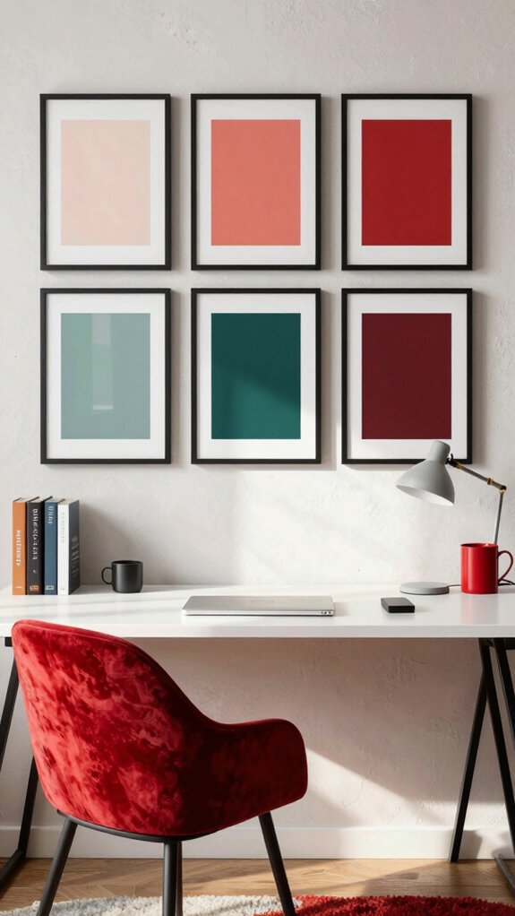
Now that we’ve seen how Cloud Dancer functions in seasonal styling, I want to look back at how Pantone’s past picks have influenced design trends and what makes this white feel different.
I see a clear line of historical significance from Cerulean in 2000 to Classic Blue, Viva Magenta, and Very Peri — each choice mirrored cultural reflections and evolving moods.
I want you to feel included in that conversation, so here are four concrete comparisons and tips:
- Cerulean set a hopeful tone; use airy palettes to echo optimism.
- Classic Blue offered stability; pair it with grounded textures for trust.
- Viva Magenta brought bold energy; contrast it with neutrals for balance.
- Very Peri signaled innovation; introduce subtle accents to suggest progress.
Cloud Dancer asks us to design calm, fresh starts that invite communal warmth.
Why White Was Unexpected
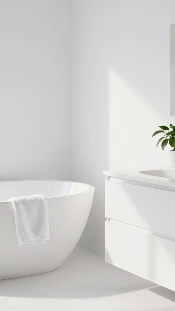
Surprise is part of what makes Cloud Dancer so interesting — I didn’t expect Pantone to pick a white, and you probably didn’t either, which is exactly why this choice sparks conversation.
I felt the pick was an unexpected color move because past selections favored bold hues; white breaks that pattern and asks us to slow down. Some critics see a cultural disconnect, claiming it ignores lively trends, but I find white’s quiet luxury offers a clean slate we can all shape together.
Think of Cloud Dancer as minimalist permission: it pairs with bold accents or serene neutrals, fits spa-like branding, and invites reinterpretation.
My tip: test undertones and texture to avoid flatness and build inclusive, comforting designs.
How to Apply It Beyond Walls
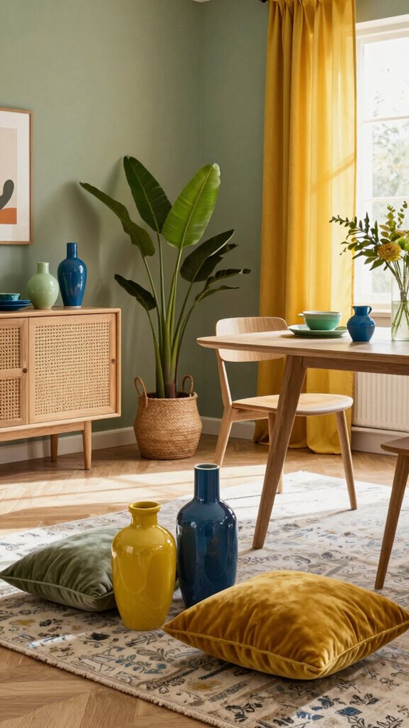
If you want to take Cloud Dancer beyond paint, start by thinking of it as a unifying thread that can run through branding, textiles, digital design, furniture, and events — each use will shape how the color reads.
I’ll show simple, connected ways to use it so people feel welcome and included, tapping color psychology and emotional resonance.
- Use Cloud Dancer in logos and packaging to signal calm modernity and coordinate product stories.
- Add cushions, throws, and curtains to create soft continuity and tactile comfort across rooms.
- Bring it into websites and social posts for a gentle, cohesive interface that guides attention.
- Accent with chairs, artwork, lighting, and table florals at events to make memorable, immersive moments.
These steps help the hue belong everywhere, without overwhelming.