
I’ve pulled 19 cabinet colors that feel fresh and timeless, from classic whites and warm greige to soft sage, muted blue-grays, deep navy, matte black, and natural woods. I’ll compare practical pairings—like navy lowers with white uppers, sage with wood accents, or matte black with brass—and note upkeep tips and resale-friendly choices. I’ll also show how to mix neutrals, add a bold island, and use finishes so your kitchen stays stylish and easy to maintain.
Key Takeaways
- Choose warm whites (e.g., White Dove, Alabaster) for brightness, versatility, and easy pairing with marble, wood, or bold tile.
- Use warm greige or muted blue-gray for a calm, timeless foundation that complements wood tones and varied lighting.
- Select soft sage or pastel accents on lower cabinets or open shelving for subtle personality without overwhelming the space.
- Introduce deep hues—navy, charcoal, or dark green—on islands or lowers for drama, balanced by light counters and warm metals.
- Favor natural wood finishes or durable, washable paints plus textured hardware for longevity, easy upkeep, and enduring style.
Classic White Cabinets
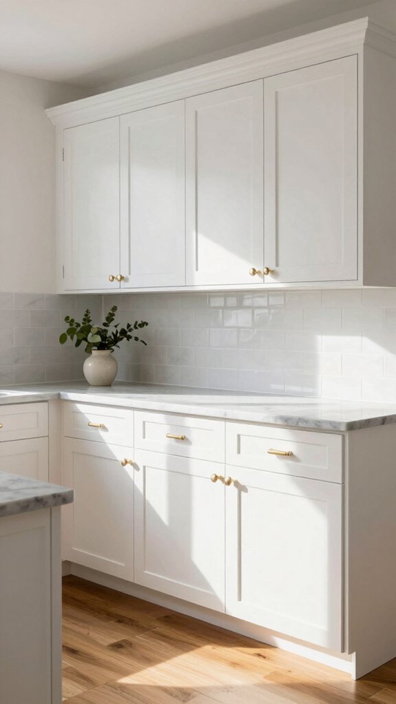
When I picture a kitchen that feels both fresh and timeless, classic white cabinets always come to mind, and for good reason: they brighten the room, simplify styling, and work with nearly every design. I love how classic white cabinets signal purity and simplicity while fitting modern or traditional looks; that classic white versatility means you can pair them with marble, butcher block, or bold tile. White cabinet trends keep changing, yet the core benefit stays the same: more light and wider appeal, which helps resale value. My practical tip is to choose warm whites like White Dove or Alabaster if you want softness, and mix textures—glossy doors, matte counters—to update the look easily.
Warm Greige Tones
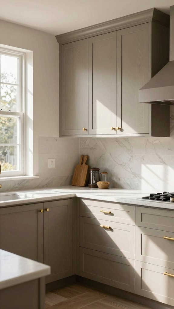
Because greige sits neatly between gray and beige, I often reach for warm greige cabinets when I want a kitchen that feels calm, cozy, and modern all at once. I love how greige color psychology supports a sense of belonging; it reads neutral without feeling cold, so family and friends relax naturally. Start by pairing greige with natural wood tones and earthy accents for balance, then layer lighting and brass or matte black hardware for contrast. For texture, try greige texture combinations like smooth painted cabinets with open wood shelving or veined stone countertops to add depth. The result stays timeless yet easy to update — swap colorful rugs or dishes when you want a fresh mood without repainting.
Soft Sage Green Cabinets
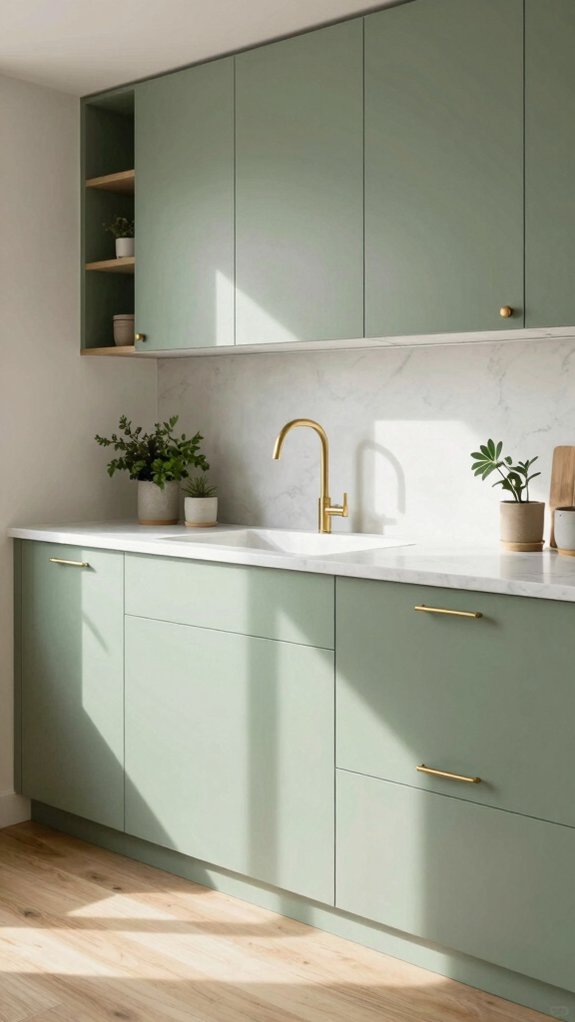
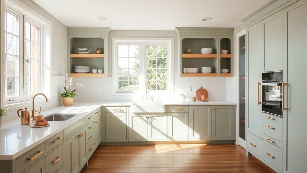
If you like the cozy neutrality of greige but want something with a bit more personality, soft sage green cabinets are a lovely next step — they bring a calm, natural vibe without shouting for attention. I love how sage green palettes make a kitchen feel like a welcoming room; they team beautifully with wood tones and natural materials, so you get warmth and tranquility at once. For smaller kitchens, pair them with soft whites or light grays to open the space and keep it airy. I find cabinetry styling simple here: keep hardware subtle and textures organic. Below are practical tips to guide your choices so your kitchen feels like it belongs to everyone who gathers there.
- Pair with warm wood and natural stone for balance
- Use soft whites or light grays to enlarge the feel
- Choose matte finishes and simple hardware for timelessness
- Blend modern and farmhouse elements for versatile style
Deep Navy Blue Statement
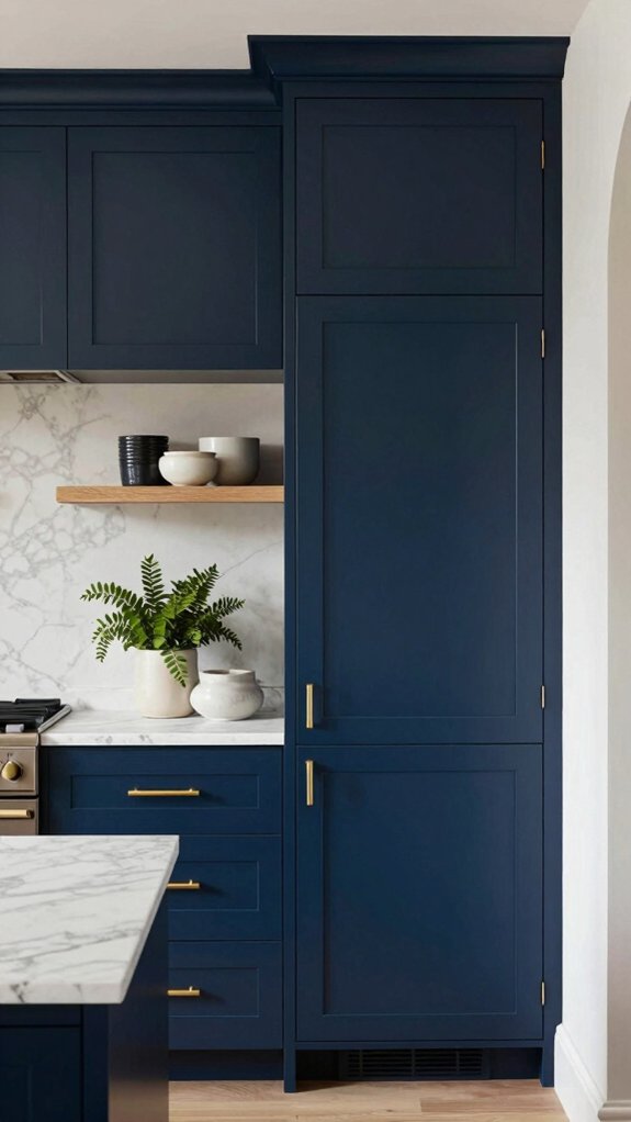
Though deep navy blue can feel bold, I love how it instantly gives a kitchen a dramatic, sophisticated anchor that still plays nicely with other elements—pair navy lower cabinets with white uppers or a light marble countertop to keep the room open, or go full-on statement with all cabinetry in navy for a cozy, cocoon-like effect. I lean into navy blue sophistication by adding brass or matte nickel hardware and a natural stone backsplash; those textures warm the space and keep it feeling modern yet lived-in. For balance, use lighter walls or open shelving so the room breathes. This color has real timeless appeal, boosts resale potential, and adjusts easily—mix materials, swap accents later, and it’ll still feel fresh.
Matte Black Modern Look
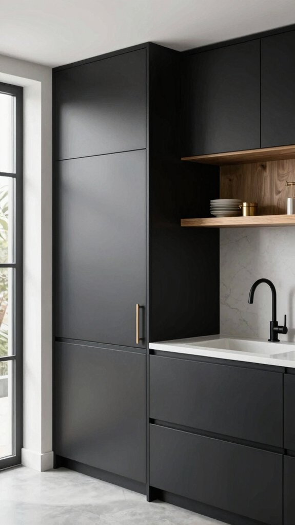
Matte black cabinets bring an instant modern edge to a kitchen, and I love how they read as both luxurious and surprisingly approachable—pair them with light countertops and brass or chrome fixtures for eye-catching contrast, or add warm wood accents to soften the look. I often recommend matte black for its matte black elegance and practical benefits: it hides fingerprints better than glossy finishes and anchors a room without feeling cold. Its matte black versatility means you can go industrial, minimalist, or warm contemporary, and it stays timeless when balanced with natural materials.
- Use light quartz or marble counters to brighten the palette.
- Add warm wood open shelving for texture and welcome.
- Choose brass hardware for a luxe touch.
- Keep lighting layered to avoid a heavy feel.
Cream and Off-White Variations
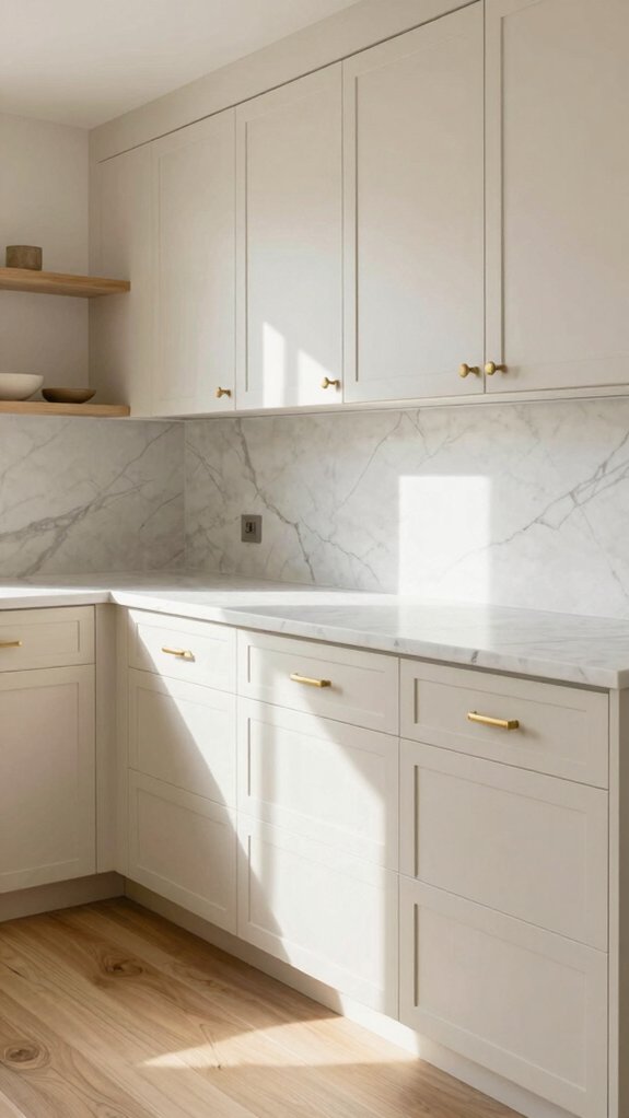
After enjoying the bold drama of matte black, I often steer people toward cream and off-white variations when they want a softer, more inviting kitchen mood. I love how cream cabinetry trends—like Sherwin-Williams Alabaster or Benjamin Moore White Dove—bring warmth and timeless elegance, and they mix easily with many styles. Off white versatility means these tones soften stark contrasts, reflect light, and can make a space feel airy without feeling cold.
| Benefit | Tip |
|---|---|
| Warmth | Pair with wood or brass accents |
| Timelessness | Choose classic finishes for longevity |
| Light reflection | Use near windows for brightness |
| Versatility | Combine with bold island colors |
I encourage you to choose a shade that feels like home and layers comfortably with your finishes.
Light Gray for Small Kitchens
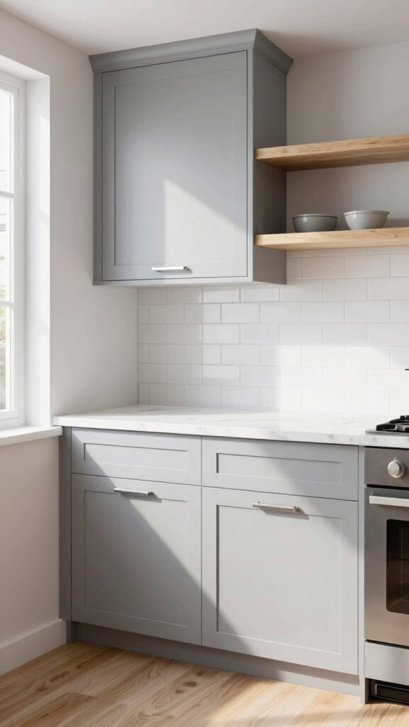
If you want a look that’s calm but never boring, light gray cabinets are a smart choice for small kitchens because they add depth without shrinking the room. I love how light gray aesthetics lift a compact space — it bounces natural light and makes the room feel airier while keeping a cozy vibe. I find it pairs easily with bright or muted accents, so you can personalize without chaos. For a balanced feel, layer with whites or soft neutrals and add texture in countertops or backsplashes.
- Reflects light to increase perceived space
- Works with warm or cool accents for flexibility
- Holds resale appeal while staying modern
- Easy to update with hardware or paint touch-ups
Choose finishes that welcome you home and invite friends in.
Earthy Beige Neutrals
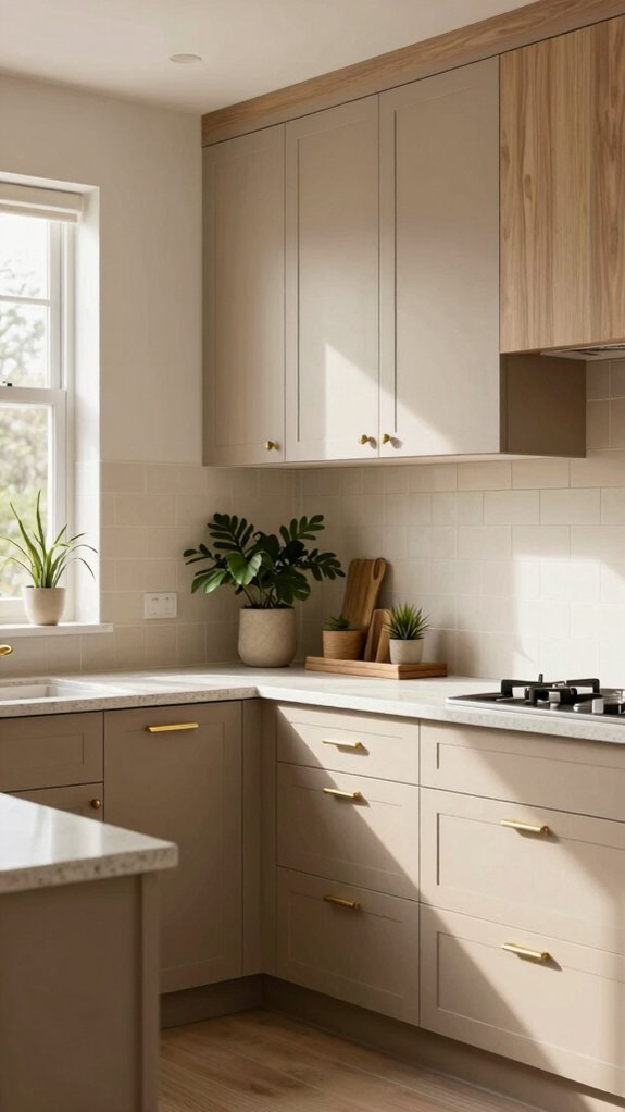
Warmth is what draws me to earthy beige neutrals like taupe and greige, and they’re a great go-to when you want a kitchen that feels inviting without shouting for attention. I lean into beige cabinet trends because these tones create a calm backdrop that welcomes family and friends, yet still works with bold accents if you want them later. For practical tips, pair cabinets with natural wood countertops or woven textures—earthy tone pairings that boost coziness and highlight sunlight, making small kitchens feel larger. I also recommend swatches like Sherwin‑Williams Natural Tan or Benjamin Moore Manchester Tan to test under your light. Choosing these neutrals is smart for resale, since they appeal broadly and keep your kitchen timeless.
Two-Tone Cabinet Combinations
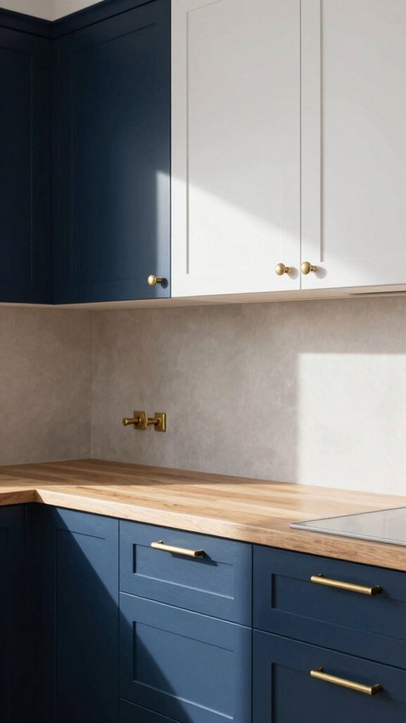
I love how upper-and-lower contrast can instantly change a kitchen’s mood, so I often recommend pairing darker base cabinets with lighter uppers to keep the room grounded yet airy. For a crisp, classic look try navy lowers with white uppers, or if you want something calmer go for sage or deep gray below with creamy or soft-gray tops to balance the palette. Start by choosing which zone you want to anchor—floors and islands usually suit the darker color—then test small samples on both upper and lower doors to see how light and sightlines play together.
Upper and lower contrast ideas
Why not give your kitchen a fresh, layered look by pairing lighter upper cabinets with darker lower ones? I love how contrasting color combinations and simple visual interest techniques can make a kitchen feel both roomy and grounded. Lighter uppers keep sightlines airy; darker lowers—navy, charcoal, or deep green—anchor the space and add sophistication.
- Pair classic white uppers with navy lowers for a timeless, versatile contrast.
- Use charcoal or black lowers to define zones in an open plan and hide scuffs.
- Choose deep green lowers to bring warmth while keeping uppers bright and welcoming.
- Test both colors with your countertops and floor to guarantee cohesive balance.
I’ll help you pick combos that fit your home and make you feel right at ease.
Muted Blue-Gray Shades
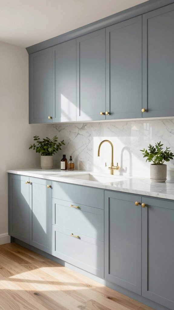
Even though trends come and go, I still reach for muted blue-gray shades like Sherwin‑Williams Delft when I want a kitchen that feels both polished and welcoming. I choose these tones because blue gray combinations create a calm foundation that works with many styles, so you and I can imagine a space that fits our lives. Pair muted blue-gray cabinets with white or soft gray trim for subtle contrast, or introduce warm metals and simple tiles to boost depth without drama. For a serene kitchen ambiance, keep countertops light and add a few textured accents to invite touch. These shades play nicely across generations, so they’re practical for resale and personal comfort — timeless, versatile, and quietly confident.
Natural Wood Finish Cabinets
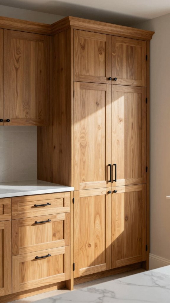
I love how natural wood cabinets—whether oak, maple, or walnut—instantly warm a kitchen and show off grain patterns that give each piece its own character. Oak brings a classic, durable look with visible grains, maple feels light and airy for bright spaces, and walnut adds rich depth and a more formal vibe, so pick based on how cozy or polished you want the room. Keep in mind simple care like regular cleaning and a protective finish will help whichever wood you choose stay beautiful for years.
Oak, maple, and walnut looks
Wood grain has a way of making a kitchen feel lived-in and welcoming, and I’ll walk you through how oak, maple, and walnut each bring their own personality to the room. I love how oak cabinet trends shift—oak can be sturdy and classic, from golden to deep tones; choose wider planks for rustic charm or slim profiles for modern looks. Maple feels light and clean, its smooth grain brightening small kitchens and pairing well with pale counters. Walnut kitchen elegance gives depth and drama; use it for islands or upper cabinets to anchor the space. Each wood ages beautifully and fits many styles, so pick finishes that reflect your daily life and invite others in.
- Oak: durable, versatile tones and grains
- Maple: smooth, bright, modern-timeless
- Walnut: rich, luxurious focal points
- Mix woods thoughtfully for balance
Charcoal Gray Depth
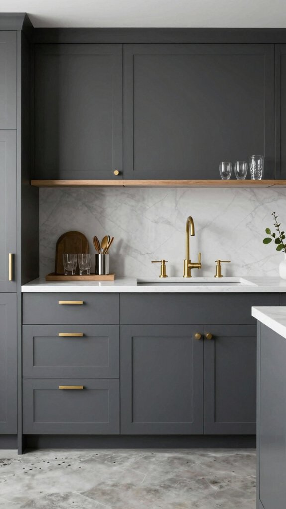
When I pick charcoal gray for cabinets, I’m choosing a color that brings real depth and versatility to the kitchen. I love charcoal gray sophistication because it feels grounded and elegant, yet welcoming — it fits both modern and traditional rooms. Start by pairing it with light countertops and soft walls to create crisp contrast that makes the cabinets pop. For warmth, add natural wood shelves or floors; the mix balances contemporary edge with cozy charm. Practically, charcoal hides smudges and wear, so it’s great for busy homes. Think about hardware finishes: brushed brass warms the tone, matte black keeps things sleek. Embrace charcoal gray versatility by layering textures and lighting, and you’ll have a timeless, inviting kitchen.
Pastel Cabinet Accents
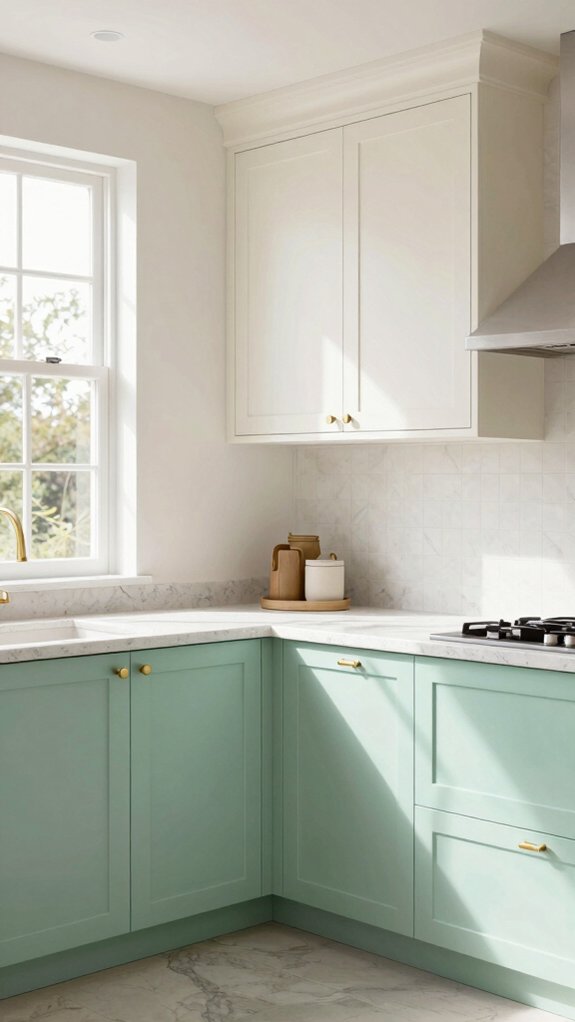
A soft pop of pastel can quietly change the whole mood of your kitchen, and I’m a big fan of using accents like mint, blush, or lavender to do it. I love how pastel color palettes bring calm and charm without stealing the show; they pair beautifully with white or neutral cabinets and feel timeless. Try placing muted hue combinations on open shelving or lower cabinets to add personality while keeping the room grounded. I also like mixing pastels with natural wood or subtle metallics for depth and contrast.
- Use mint on lower cabinets for a fresh, lived-in look.
- Add blush on a single island face to invite warmth.
- Try lavender in small appliance niches for whimsy.
- Combine pastels with wood grain for lasting cohesion.
Dark Green Moody Kitchens
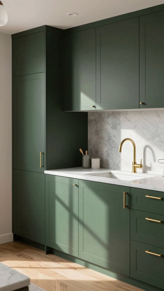
Although dark green cabinets can feel dramatic, I’ve found they actually make the kitchen feel warm, grounded, and surprisingly inviting. I choose deep shades like Sherwin-Williams’ Rosemary for the dark green aesthetics they bring; they read moody but never cold. Pair them with natural wood shelves or island faces to add texture, and choose brass or gold hardware to lift the look with a cozy glow. For balance, I use lighter countertops and a pale backsplash so contrast brightens the space without losing that timeless appeal. This palette works across styles — modern, traditional, or cottage — and feels rooted in nature. If you want a kitchen that welcomes friends and feels calm, moody kitchens in dark green are a safe, stylish bet.
Taupe for Transitional Styles
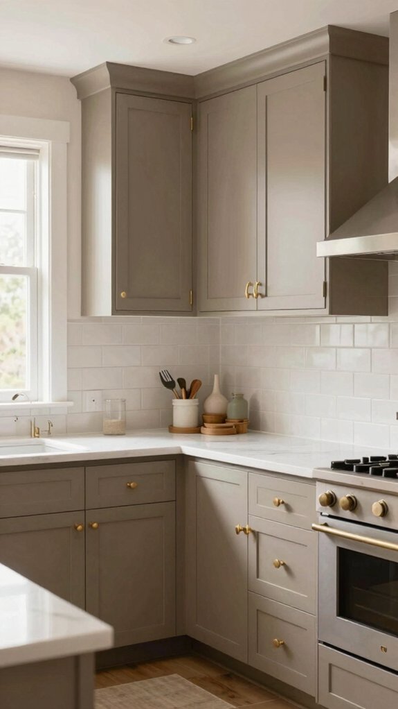
Because taupe sits between gray and beige, I turn to it when I want a kitchen that feels both modern and comfortably familiar — a true transformative choice. I love how taupe cabinetry benefits show up in balanced rooms: it warms a cool tile, tones down bright accents, and still reads contemporary next to clean lines. I recommend testing swatches at morning and evening light so the shade feels right.
- Pair soft taupe with natural wood for warmth and with matte black for sleek contrast.
- Use taupe color combinations that include soft whites and muted blues to keep things calm.
- Let taupe be a neutral backdrop for colorful textiles and ceramic pieces.
- Choose slightly warmer taupe in north-facing rooms, cooler taupe in direct sun.
You’ll end up with a welcoming, timeless kitchen that invites everyone in.
High-Gloss Cabinet Colors
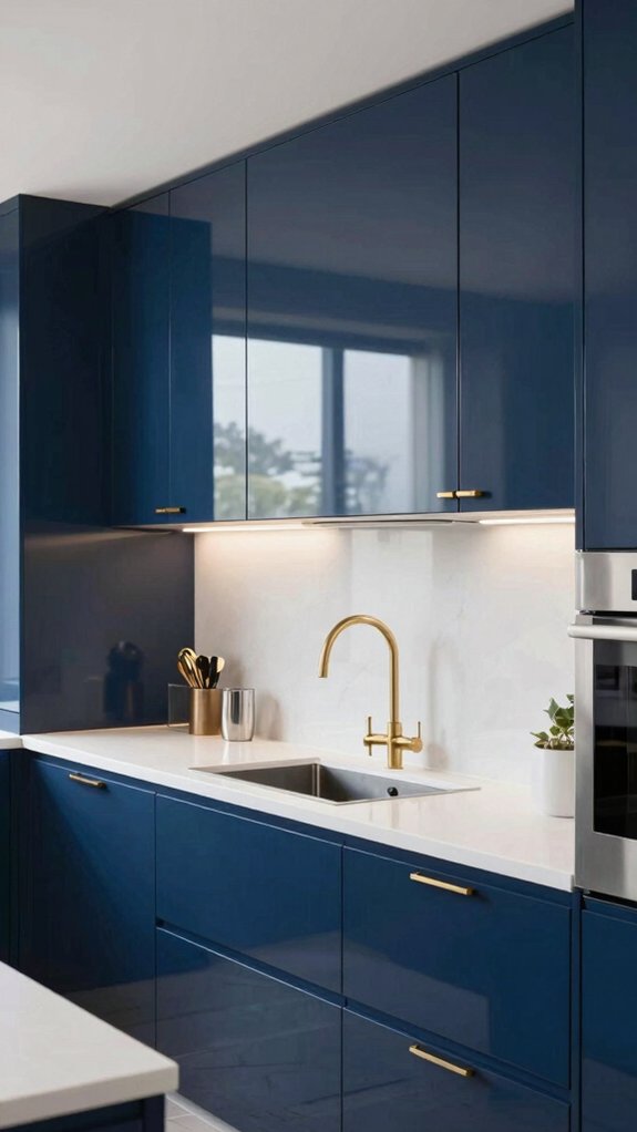
If you liked taupe for its warm-but-modern feel, you’ll probably enjoy how high-gloss cabinets play with light to make a kitchen feel brighter and bigger. I love how high gloss durability blends with style — glossy whites, deep navy, or bold black bounce light and open small spaces. They’re easy to wipe clean, too, so the finish stays fresh.
| Finish | Look | Tip |
|---|---|---|
| White gloss | Bright, airy | Use warm bulbs |
| Navy gloss | Dramatic | Pair with wood |
| Black gloss | Sleek | Add matte accents |
| Mixed finishes | Balanced | Test in your light |
Consider surrounding lighting and try samples; light reflection can change color dramatically, and I’ll help you find the right one.
Vintage-Inspired Muted Colors
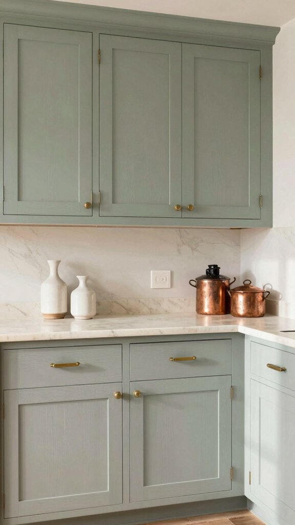
Vintage-inspired muted colors have a quiet way of making a kitchen feel both lived-in and up-to-date, and I love how they instantly set a calm, welcoming tone. I lean into vintage color palettes like soft taupe, dusty blue, sage, and muted mustard because they bring nostalgia without feeling dated. Muted tone combinations work with wood, brass, or white countertops, so you can mix old and new confidently. They help a kitchen feel like it belongs to a family’s stories while still appealing to buyers.
- Pair dusty blue with warm wood to balance cool and cozy.
- Use sage or olive to connect cabinets with plants and natural textures.
- Accent with faded terracotta for subtle personality.
- Keep hardware simple for timeless harmony.
Bold Color Island Cabinets
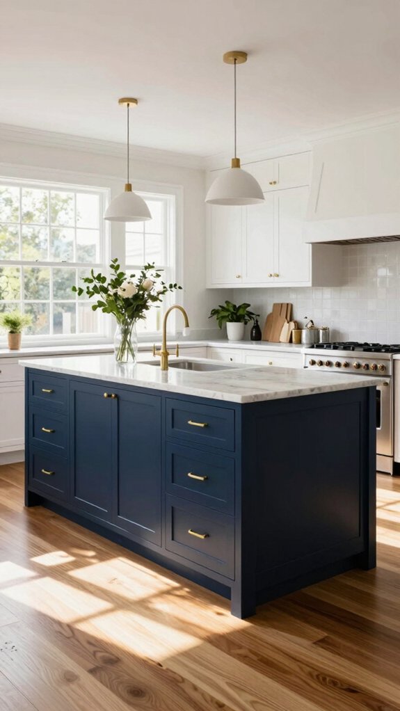
I like using a bold color just on the island so the kitchen has a clear focal point without feeling busy, and navy or deep green can be timeless choices while mustard or burgundy bring warmth. Think about how natural light, countertops, and flooring will change the shade you see, and pair the island with white or soft gray surrounding cabinets to keep the look balanced. Start by testing samples in different light and choose the strongest color for the island so the rest of the kitchen can stay calm and airy.
Color focus without overwhelm
When I want a kitchen that feels lively but not chaotic, I turn to a boldly colored island—think deep navy or rich forest green—paired with neutral perimeter cabinets to keep the look grounded. I like bold color contrast because it gives the room a clear focal point while preserving kitchen design balance; the rest of the room stays calm in white, soft gray, or warm wood. Choose durable paints like Emerald Urethane Trim Enamel and plan for simple upkeep so the color stays fresh. Add natural materials and metallic accents to connect modern and classic vibes, and invite friends to enjoy the space you’ve personalized.
- Pair the island with light cabinetry for contrast and calm
- Use wood or brass to warm the palette
- Pick high-quality, washable paint
- Keep clutter minimal for impact
Timeless Neutral Mix Approach
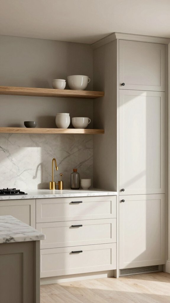
Because neutral doesn’t have to mean boring, I like using a timeless neutral mix to make a kitchen feel calm, roomy, and ready for whatever comes next. I rely on neutral color psychology and timeless design principles to choose whites, soft grays, and beige that play well together and with people. Start with a dominant quiet tone — a warm white or greige — then layer soft taupe or muted gray on cabinets or an island for depth. Test swatches in morning and evening light; natural light shifts change warmth and contrast. Keep hardware and countertops textural so accents can be swapped easily; neutrals create a flexible backdrop for trendy colors. This approach feels inclusive, boosts satisfaction, and helps resale value without fuss.